Brand, Logos & Usage
Please read the usage guidelines fully before you use our logo and brand assets.
These guidelines cover our brand assets, including but not limited to:
- The names “LooksRare” and “LOOKS Token”
- The LooksRare logo (text and icon)
- The LOOKS diamond-eye icon
Download LooksRare Logo and Brand Assets
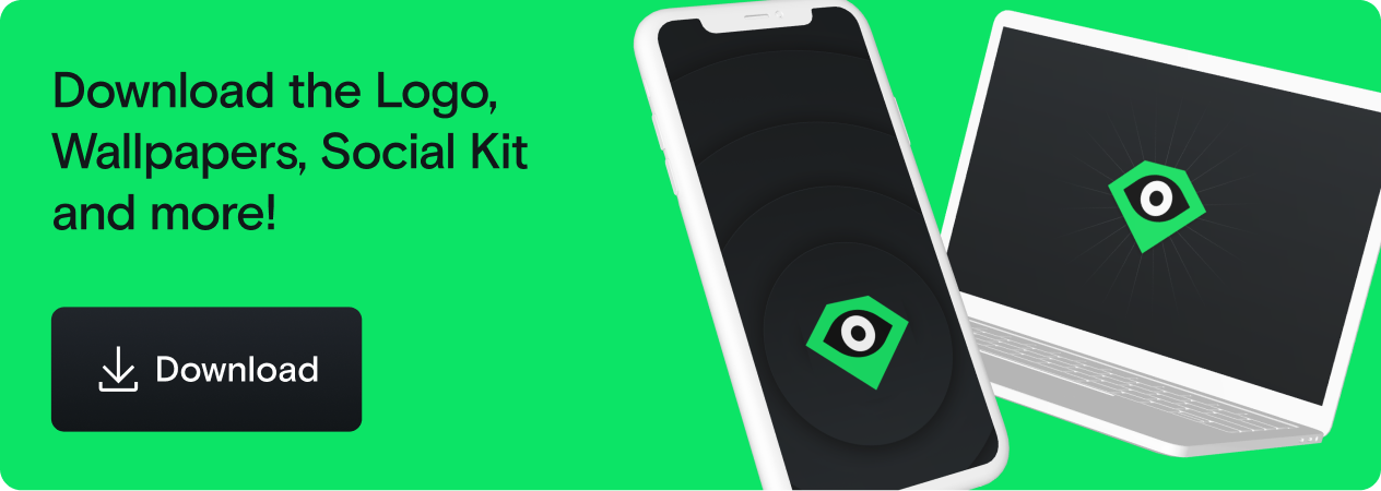
This ZIP file contains:
- LooksRare logos
- Device wallpapers / brand images
- A community social media kit so you can rep the project on Discord, Twitter, Instagram... and other NFT marketplaces!
Intro
LooksRare is pretty open minded and flexible with our icon, but not our name.
We encourage creators to make derivative artworks based on the icon, and tbh we wanna see the community get real weird with it. If you’re selling derivative works, please give attribution and make sure you follow the guidelines here carefully so we don’t have a disagreement. If it’s dope, @ us on social so we don't miss it!
BUT, our logo and name are important, copyrighted parts of our brand, and we must protect them. So let’s go over a few ground rules.
What Can I Do?
✅ 👍 You Can:
- ✅ Recreate, remix, create derivative artworks featuring the diamond icon, with attribution.
- ✅ Buy and sell said derivatives, if you give attribution.
🚫 👎 You Can’t:
- 🚫 Use our Brand Assets (logo, icon, name,) or any derivative works in any product/brand name, brand logo, etc. that can conflict or compete with LooksRare. For example:
- Don’t make an NFT marketplace called “LooksExpensive”
- Don’t make a digital art brand or product with a similarly-shaped diamond logo with an eye, even if it’s colored yellow.
- Don’t make a product called “LooksRare Tools” or similar that may be misinterpreted as having an official relationship to LooksRare.
- 🚫 Use or remix any of our Brand Assets to imply an official relationship, partnership, or other endorsement where there is none.
- 🚫 Use the name “LooksRare” in full in social media channels in a way that implies any official relationship to us. If you make a community group, Twitter account etc., make it clear that it’s not officially tied to LooksRare.
- 🚫 Falsely claim or suggest any sort of official relationship, partnership, or other endorsement in any way.
If in doubt, reach out to [email protected]
Logo Guidelines
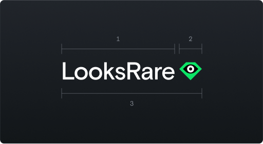
Logo Anatomy
- Logotype. Set in Basis Grotesque using Camel Case for the L and R. There is no spaces in the LooksRare name.
- Icon. The eye watches you as you paperhand your JPGs.
- The Logo = Logotype + Icon. Always use the logo in the exact proportion provided.
Variations
Icon - Can be used on its own to represent the LooksRare platform or brand.
Logo - This is the LooksRare logo in all its glory.
LOOKS Token - Use the icon in black on a green background to represent the token.
![]()
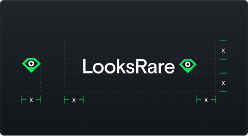
Logo Clear Space
Give the logo breathing room. Keep a space around the logo that's equal to at least the width of the diamond icon (x) on all sides.
![]()
The downloadable assets have the correct proportions already, but anyway: the clear space around the diamond icon must be at least 1/4 the width of the icon (y/4).
Logo Colors
Green is LooksRare’s brand color. It’s vibrant, saturated, slightly acidic, and generally stands out because it’s great. We like the green.
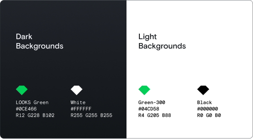
When you’re using the LooksRare logos, never adapt or recolor the files manually: just use the correct version provided for your use case. The RGB values and hex codes are shown just for your reference.
Logos on background colors
![]()
Make sure the logo and icon are always fully visible against the background. 1 & 2 - Use the colored logos on monochrome backgrounds 3 & 4 - Use the monochrome logos on colored backgrounds
We use a different shade of green on different backgrounds, and a different version of the icon.
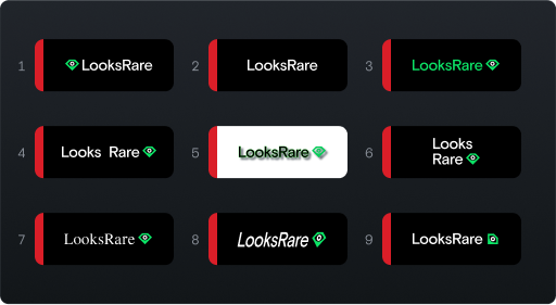
Logo Restrictions
Common sense stuff really.
- Do not move the icon to the left
- Do not remove the icon
- Do not change the text color
- Do not add a space between “Looks” and “Rare”
- Do not add drop shadows or distort the text
- Do not try to create a stacked version of the logo (Use the Icon alone if the full logo isn’t suitable for your use case)
- Do not change the typeface
- Do not skew or distort the dimensions of the logo
- Do not rotate the logo or elements of the logo
Flexibility
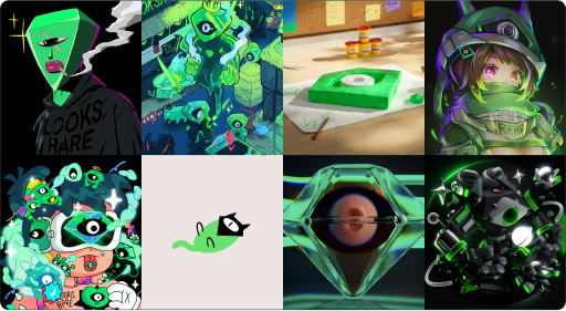
OK, we just got through some examples of what not to do with our logo specifically in official comms, but LooksRare’s brand should stand as a symbol for the Web3 community. In that spirit, we welcome any and all artistic expressions that incorporate the LooksRare brand faithfully. Show your skills 👀💎
Artwork featured below by @tana_547, @PonderingDraw, @adsgnz, @Souiii_Arts, @PhuTwenty_, @sammjeenn, @basherbash5, @suriyanoom1
Again, if you’ve got any questions, shoot us an email at [email protected]